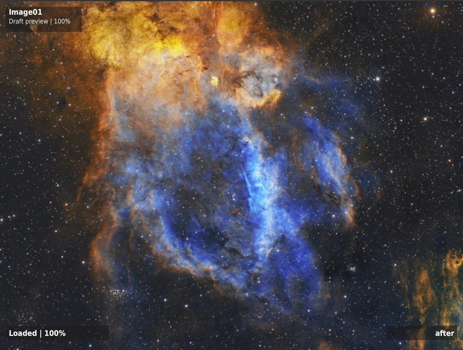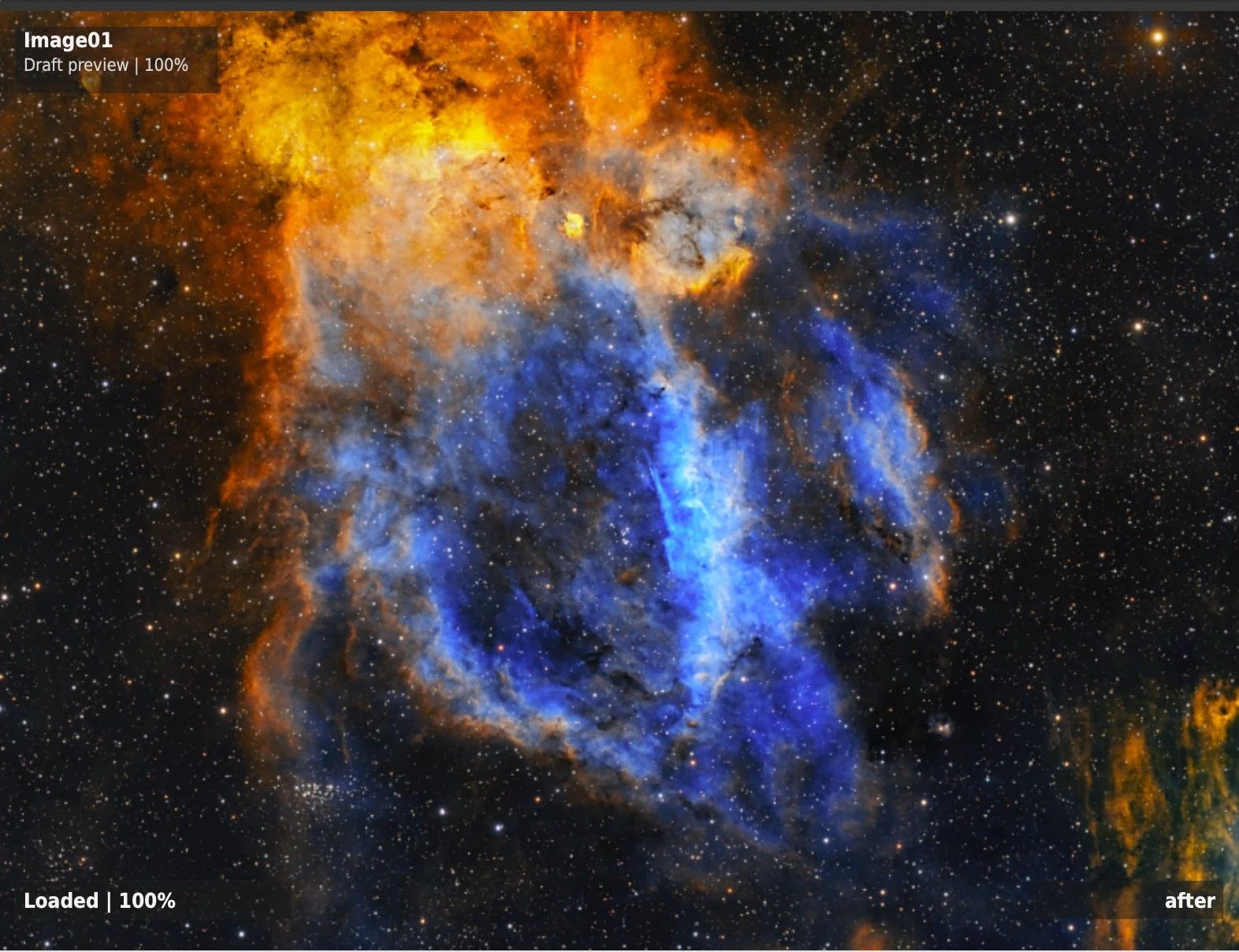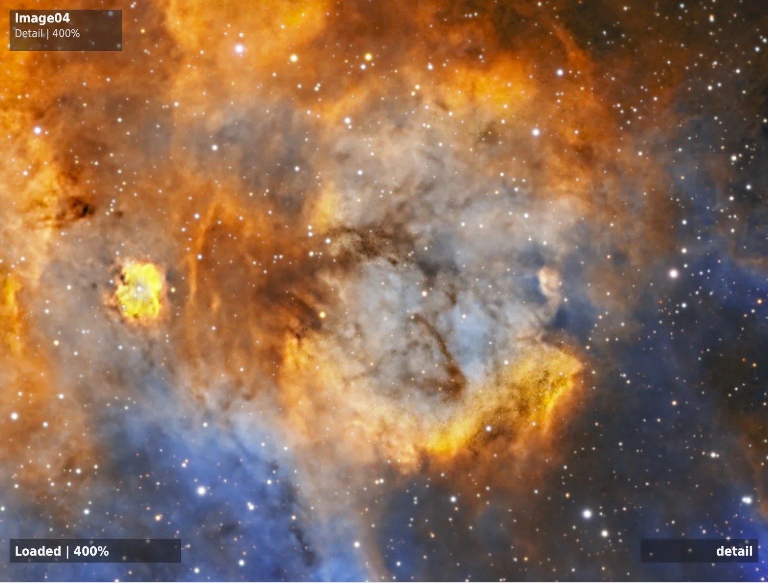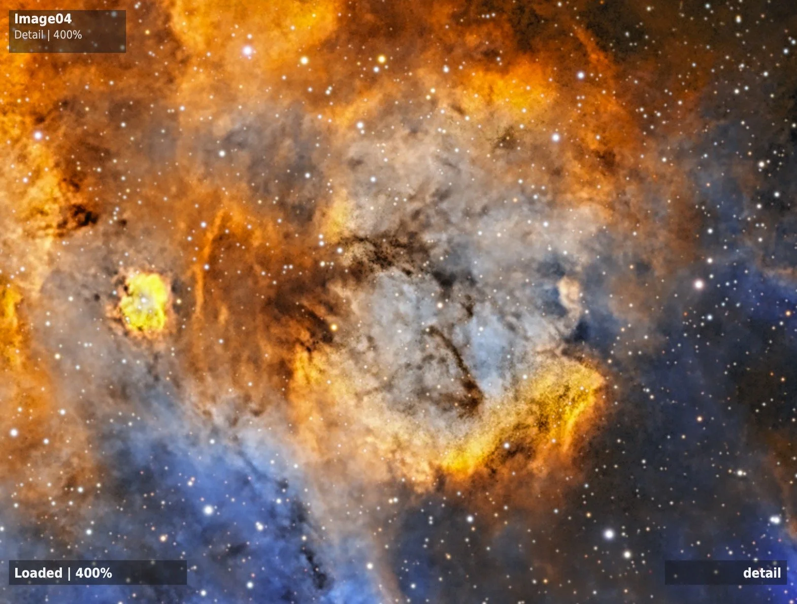
Astro Contrast Enhancer!

Cosgrove's Cosmos Software First Public Release

Multi-scale contrast enhancement for stretched astrophotography images.

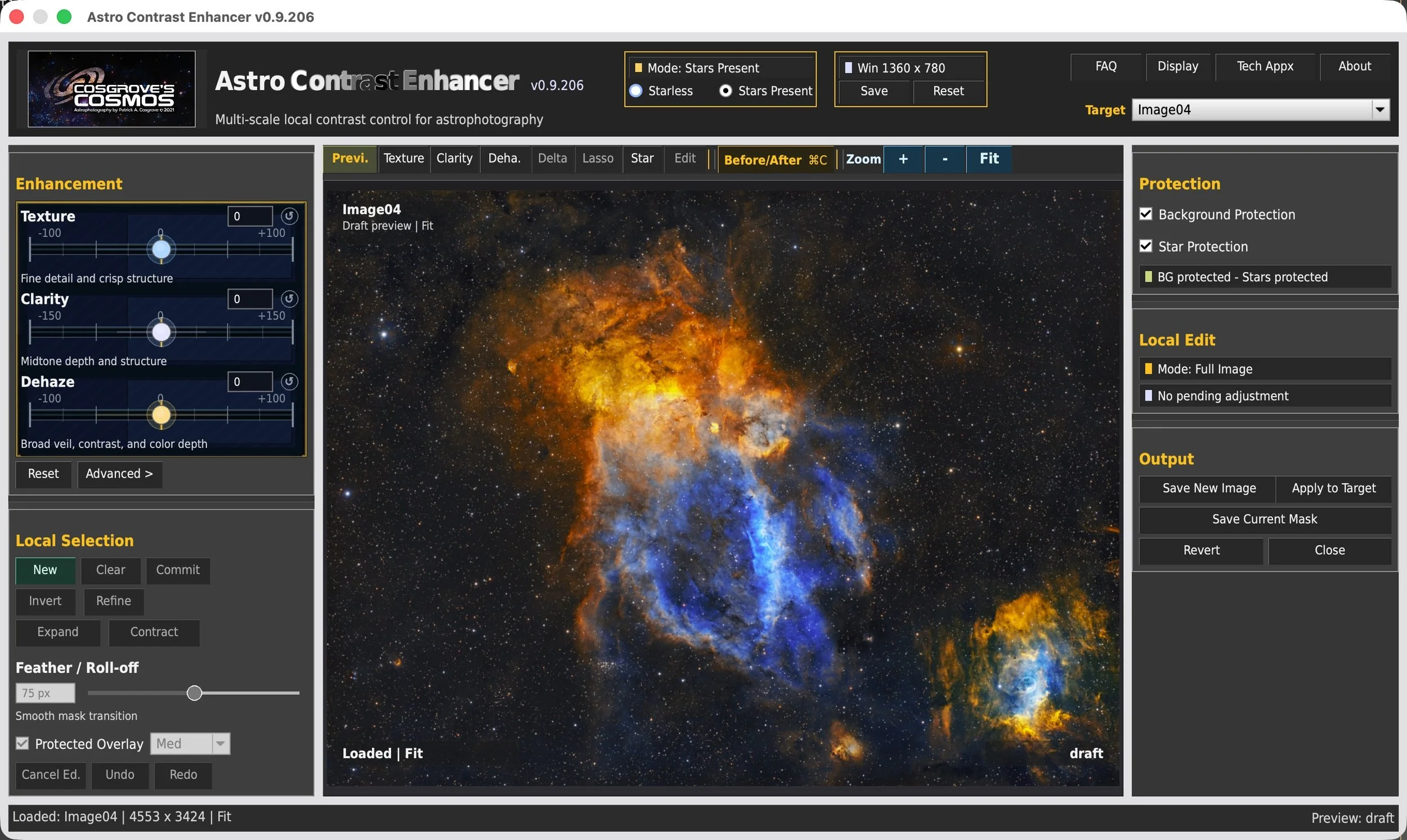
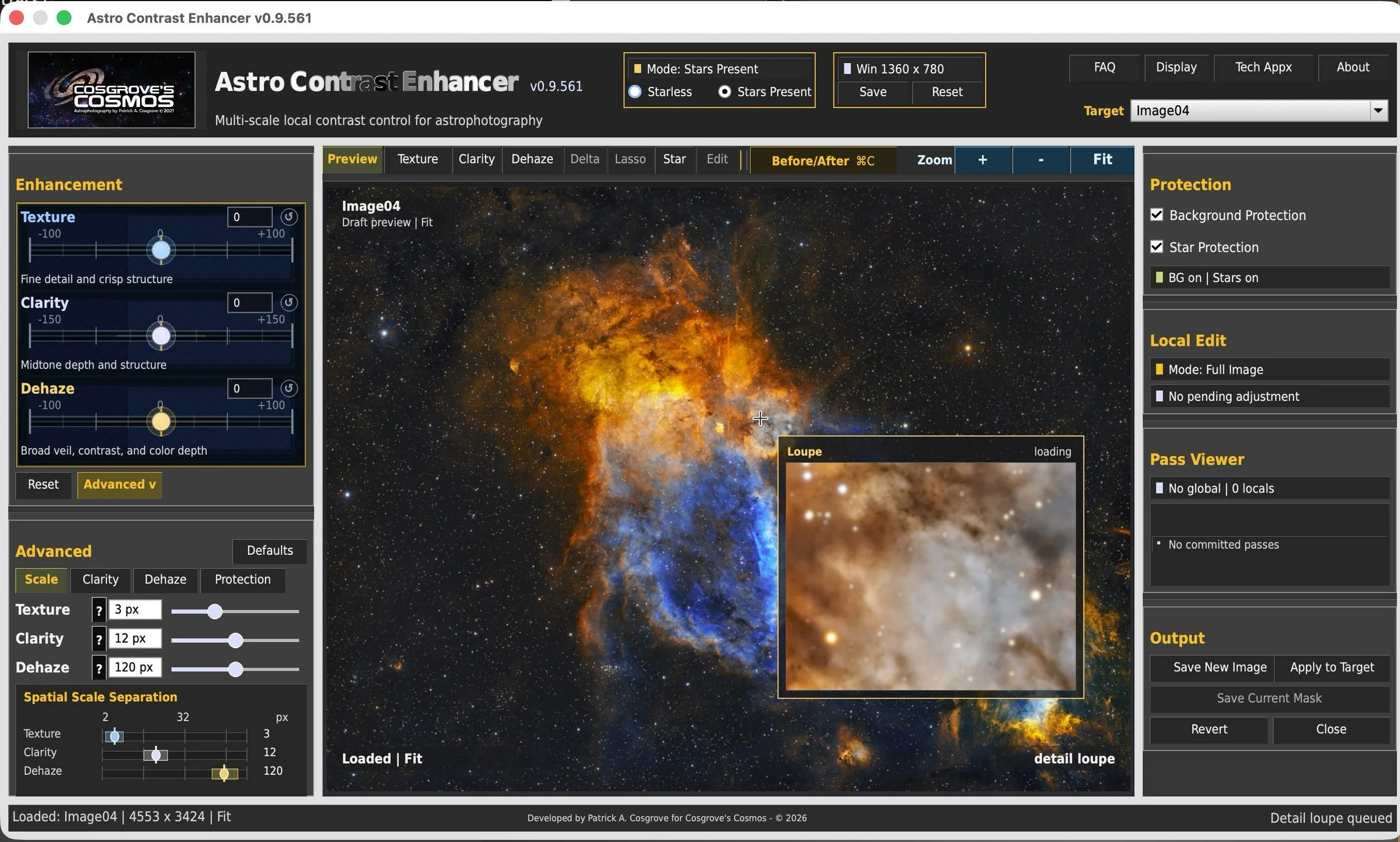
Explore fine structure, midtone depth, and broad tonal separation through interactive Texture, Clarity, Dehaze, protected local editing, and real-time visual feedback inside PixInsight.

Texture Clarity Dehaze Local Editing
Built for my own astrophotography workflow and freely shared in the hope that others may find it useful in theirs.
Astro Contrast Enhancer for PixInsight, showing Texture, Clarity, Dehaze, local editing, and built-in image protection controls.
Interactive contrast enhancement designed for PixInsight
Reveal detail. Open depth. Lift the veil. ACE brings several of the contrast-finishing controls I wanted for my own images into one interactive, astrophotography-focused PixInsight workflow.
Why I Built It

The Story Behind ACE

Astro Contrast Enhancer began with a repeated interruption in my own image-processing workflow.

Like many PixInsight users, my image-processing workflow evolved over time. PixInsight remained at the heart of that workflow, but I often found myself making one final stop before declaring an image finished. More often than not, that stop was Photoshop.

It was not because PixInsight lacked excellent contrast tools—it certainly does not. Rather, I had become accustomed to Photoshop's Texture, Clarity, and Dehaze controls as an intuitive way to make the final refinements that gave an image a little more structure, depth, and visual presence.

After repeating that workflow for years, I began wondering what those capabilities might look like if they were designed specifically for astrophotography and integrated directly into PixInsight.

That question eventually became Astro Contrast Enhancer.

ACE is not intended to replace PixInsight's established processing tools. Instead, it complements them by providing an interactive environment for late-stage contrast refinement after an image has been stretched.

I originally wrote Astro Contrast Enhancer because it solved a problem in my own workflow. After using it extensively on my own images, I decided to share it freely in the hope that other astrophotographers may find it useful as well. Patrick Cosgrove
Takeaway ACE was not created to replace PixInsight or Photoshop. It grew from a simpler goal: keep the contrast-finishing adjustments I regularly use inside one PixInsight workflow.
Before looking at the individual controls, it helps to step back and consider why contrast refinement matters at all. Why do some astrophotography images feel dimensional while others feel comparatively flat?
Understanding the Problem

Why Do Some Images Feel Three-Dimensional?

The answer involves more than brightness. It depends on how our visual system interprets relationships within the image.

When we look at an astrophotography image, we are not simply seeing brightness and color. Our visual system is constantly interpreting subtle differences as texture, depth, transparency, and shape.

Those relationships help us recognize folds within a nebula, layered dust surrounding a galaxy, separation within a spiral arm, or delicate emission structures extending across a larger cloud.

They can create the impression that we are looking into space rather than simply looking at a flat photograph.

Much of the information needed to create that impression is already present in the image data. The challenge is making those structures easier to perceive without pushing the image toward harshness, artificiality, or an obviously overprocessed appearance.

That is where thoughtful contrast enhancement can make a meaningful difference.

The Same Image Data — Different Visual Relationships
Captured
Image Data
Our visual system interprets local relationships as:

Texture

Fine changes help reveal surface structure, edges, filaments, and small-scale detail.

Depth

Mid-scale light and dark relationships help structures appear layered, rounded, and dimensional.

Transparency

Broad tonal separation helps reduce the impression of veil and improves large-scale visual openness.

Subtle relationships remain compressed
Image may feel flatter
or
Existing relationships become easier to perceive
Image may feel more dimensional
Takeaway Good contrast enhancement is not simply about making an image more dramatic. It is about helping the existing structure become easier to see.
Fine structure, perceived depth, and broad veiling present different visual problems. I initially assumed they could be addressed by applying a similar contrast mechanism at different spatial scales. The development of ACE showed that the answer was considerably more interesting. Why did Texture, Clarity, and Dehaze ultimately require three different approaches?
Understanding the Design

Why Three Different Approaches to Contrast?

Texture, Clarity, and Dehaze may all make structure easier to see—but that does not mean they are doing the same thing at different strengths.

Like Astro Color Mixer, ACE was inspired by tools I had come to rely on in Adobe Camera Raw and Photoshop. My goal was not to reproduce those tools exactly. It was to capture the qualities I found useful while allowing my astrophotography workflow to remain inside PixInsight.

My first assumption seemed reasonable. I thought Texture, Clarity, and Dehaze were probably variations of a similar tone-and-contrast operation applied at three spatial scales: fine, medium, and broad. If that were true, three versions of the same basic mechanism should produce comparable results.

They did not. Changing the scale certainly changed the image, but the results never behaved like the tools that inspired the project. The controls felt like variations of the same adjustment rather than three distinct photographic tools.

The turning point What is each tool actually trying to accomplish?

That question changed the direction of ACE. Instead of continuing to refine one contrast mechanism, I began considering what was needed visually at each scale. That led to experimentation with very different ways of modeling and modifying the image.

Texture became focused on revealing fine structure without creating the hard, brittle appearance of aggressive sharpening. Clarity evolved into careful tone shaping intended to open the image and strengthen the perception of depth. Dehaze adopted a veiling model in which improved contrast and color emerge naturally as the apparent veil is reduced.

The development path

From One Scaled Mechanism to Three Image Models

Original hypothesis
One Contrast Mechanism
Apply a similar tone-and-contrast operation at fine, medium, and broad spatial scales.
Spatial Scale Separation
Texture 0.8
Clarity 2.0
Dehaze 4.0
× The effects remained too similar.
× They did not produce the visual behavior I was seeking.
Revised approach
Start with the Visual Purpose
Define what each control should help the viewer perceive, then build the image model around that goal.
“What visual problem is this tool trying to solve?”
Texture
Reveal fine structure
Clarity
Increase perceived depth
Dehaze
Reduce apparent veiling
Fine-structure enhancement
Careful local tone shaping
Veiling-model correction
Different visual goals led to different image models, different algorithms, and different spatial behavior.

Three Tools with Three Different Jobs

The names may be familiar, but each ACE control is built around a distinct visual objective.

01

Texture

Reveal fine structure while avoiding the harsh appearance of conventional sharpening.
Visual problem Fine detail is present but difficult to perceive.
ACE approach Fine-structure enhancement
Typical spatial behavior Fine
02

Clarity

Open the image and strengthen the impression of depth without flattening its natural tonal relationships.
Visual problem Structure is visible, but the image feels compressed or flat.
ACE approach Careful local tone shaping
Typical spatial behavior Intermediate
03

Dehaze

Reduce the impression of a broad veil that weakens separation, color, and visual openness.
Visual problem Large structures appear muted or obscured.
ACE approach Veiling-model correction
Typical spatial behavior Broad
Spatial Scale Separation
Texture 0.8
Clarity 2.0
Dehaze 4.0

Why ACE Still Exposes Spatial Scale

Although the three algorithms solve different problems, each still operates within a useful range of spatial detail. ACE exposes those boundaries through its Spatial Scale Separation controls, allowing the response of each algorithm to be tuned for different images and personal processing preferences.

So what does each approach actually do to the image? We will begin with the finest of the three: Texture.

Next: Reveal Fine Structure
Approach One

Texture: Revealing Fine Structure

Texture is designed for the smallest visible structures in the image—the filaments, edges, folds, and surface variations that help an object feel detailed rather than smooth.

The visual problem What can be done when fine structure is present in the data, but is not yet easy to perceive?

Fine detail in an astrophotography image is often subtle. A filament may differ only slightly from the nebulosity around it. A dust lane may be visible, yet lack enough local separation to stand clearly against the surrounding structure.

The first instinct may be to apply sharpening. Sharpening can be effective, but it usually works by increasing contrast around edges. Pushed too far, it can create bright and dark outlines, brittle detail, emphasized noise, and unnatural-looking stars.

ACE Texture takes a different approach. Its purpose is to make fine structural variation easier to see while avoiding the hard-edged appearance that can result from aggressive sharpening.

Conceptually, Texture is the most straightforward of the three ACE approaches: identify fine structure, strengthen its local visibility, and preserve the larger tonal relationships around it. Achieving that cleanly is computationally demanding, but the visual goal is simple.

The Goal of Texture
Structure Present

Fine variations are contained in the image, but remain difficult to separate visually from their surroundings.

Structure Revealed

The same underlying structures become easier to recognize without requiring the entire image to become more contrasty.

Traditional Sharpening

Common sharpening methods emphasize transitions around edges. This can increase apparent detail, but may also produce halos, hard boundaries, exaggerated noise, or an etched appearance when pushed too far.

ACE Texture

Texture is intended to strengthen fine structural variation while maintaining a more natural relationship between the enhanced detail and the surrounding image.

Spatial Scale Separation
Texture 3 px

Bounding the Fine-Structure Range

Texture has a characteristic fine-scale operating range, but that range is not fixed. ACE exposes the Texture scale so it can be adjusted for differences in image resolution, object size, sampling, and personal preference. The default setting is a starting point—not a rule.

Takeaway Texture is not simply a small-radius sharpening control. It is a fine-structure enhancement approach intended to make subtle detail easier to perceive while reducing the harsh artifacts that can accompany aggressive edge sharpening.
Texture helps reveal the small structures within an image. But an image can contain plenty of visible detail and still feel closed, compressed, or flat. How can tonal relationships be reshaped so that the image feels more open and dimensional?
Approach Two

Clarity: Opening Tonal Depth

Clarity is not simply a medium-scale version of Texture. Its purpose is to reshape tonal relationships so an image can feel more open, layered, and dimensional.

The visual problem What can be done when structure is clearly visible, yet the image still feels compressed, closed, or comparatively flat?

An image can contain excellent detail and still lack a strong sense of depth. Spiral arms may be visible, dust lanes may be well resolved, and nebular folds may be present—but the tonal relationships between those structures may remain too compressed to create a convincing sense of layering.

It is tempting to describe Clarity as medium-scale local contrast. That description is not entirely wrong, but it misses the most important part of what the control is intended to accomplish.

ACE Clarity is better understood as careful tone shaping. It adjusts how local light and dark regions relate to one another so structures can feel more separated, rounded, and open without simply making every transition stronger.

The goal is not merely “more contrast.” The goal is for the image to feel deeper while preserving smooth tonal movement and avoiding the flat plateaus, hard transitions, and artificial-looking separation that simpler local-contrast methods can create.

The Goal of Clarity
Tonally Compressed

Structure is visible, but adjacent tonal regions remain too similar to produce a strong impression of layering.

Tonal Depth Opened

Local relationships become easier to distinguish, giving the same structures a greater sense of depth and form.

Simple Local Contrast

A direct local-contrast operation can strengthen nearby light and dark regions, but may also create flattened tonal zones, harsh boundaries, halos, or an obviously processed appearance when pushed too far.

ACE Clarity

Clarity is intended to shape tonal relationships more selectively, opening the image and increasing perceived dimensionality while preserving smoother and more natural transitions.

Spatial Scale Separation
Clarity 12 px

Bounding the Tone-Shaping Range

Clarity generally works across broader structures than Texture, but its operating range remains adjustable. The scale control allows the tone-shaping response to be matched to differences in image resolution, sampling, subject size, and the kinds of structures the photographer wants to open. The 12-pixel default is a practical starting point, not a prescribed setting.

Takeaway Clarity is not simply medium-scale contrast. It is a tone-shaping approach intended to open the image, strengthen perceived depth, and preserve natural tonal relationships rather than merely making transitions stronger.
Clarity can make structures feel more open and dimensional. But some images have a broader problem: the entire field appears to be seen through a faint veil. What happens when that apparent veil is treated as part of the image model itself?
Approach Three

Dehaze: Reducing the Veil

Dehaze begins with a different model of the problem: that a broad veiling component is weakening separation, color, and large-scale visibility across the image.

The visual problem What can be done when large structures appear muted, washed together, or partially hidden behind a broad tonal veil?

In some images, the main problem is not fine detail or local depth. Instead, the entire field can appear softened by a broad veil that reduces separation between large structures and weakens the apparent purity of color.

That veil does not have to represent literal atmospheric haze. In astrophotography it may reflect broad background light, diffuse glow, scattered light, low-frequency tonal compression, or simply the visual impression that structures are being viewed through a translucent layer.

ACE Dehaze approaches the image using a veiling model. Rather than independently increasing contrast and saturation, it attempts to reduce the apparent veil that is suppressing visibility.

As that veil is reduced, separation becomes stronger and color often appears more pronounced. Those changes are consequences of the model, not separate contrast and color adjustments applied afterward.

The Goal of Dehaze
Veil Present

Large structures and colors remain present, but broad veiling weakens their separation and visual clarity.

Veil Reduced

Broad structure, separation, and color become easier to perceive as the obscuring component is reduced.

Contrast Plus Saturation

Increasing broad contrast and color separately may create a superficially similar result, but it can also produce clipped highlights, crushed shadows, exaggerated color, and uneven tonal behavior.

ACE Dehaze

Dehaze treats reduced contrast and weakened color as linked consequences of a veiling component. As the apparent veil is reduced, both separation and color can strengthen together through the same underlying operation.

Spatial Scale Separation
Dehaze 120 px

Bounding the Broad Veiling Range

Dehaze normally acts over the broadest spatial range of the three ACE algorithms. Exposing that scale allows the veiling model to be tuned for subjects ranging from relatively compact galaxies to extended nebulae and large background gradients. The 120-pixel default provides a useful starting point while leaving the photographer free to adjust the range for the image at hand.

Takeaway Dehaze is not simply broad-scale contrast enhancement. It uses a veiling model in which improved tonal separation and stronger apparent color emerge naturally as the obscuring component is reduced.
Texture, Clarity, and Dehaze provide three different global approaches to contrast refinement. But global adjustment is not always enough. What happens when the image needs enhancement only in a particular region—or when important areas need protection?
Applying the Effect

Local Editing: Refining Only What Needs It

Global adjustments establish the overall look of an image. Local editing makes it possible to refine one region without forcing the rest of the image to accept the same compromise.

The practical problemWhat happens when one part of the image benefits from stronger Texture, Clarity, or Dehaze—but another part does not?

Astrophotography images rarely respond uniformly. A galaxy core may already have enough contrast while the outer arms still need help. Fine nebular structure may benefit from additional Texture, while the surrounding background should remain quiet. A broad Dehaze adjustment may improve faint dust, yet make stars or bright regions feel too aggressive.

A single global setting therefore often requires compromise. The setting that is ideal for one region may be too strong—or simply unnecessary—somewhere else.

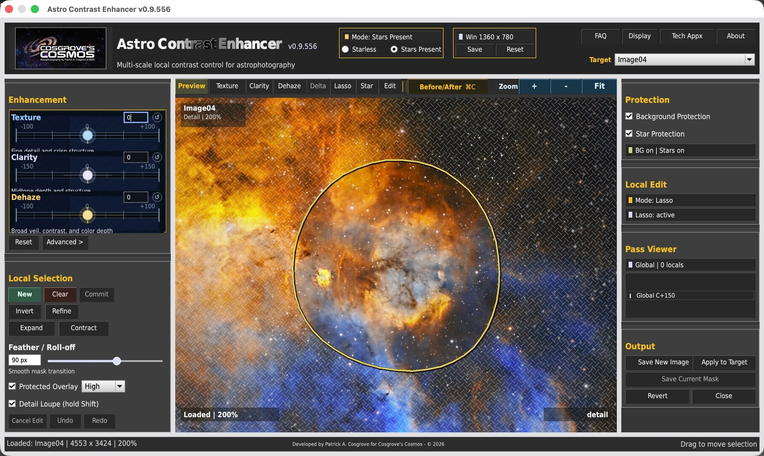
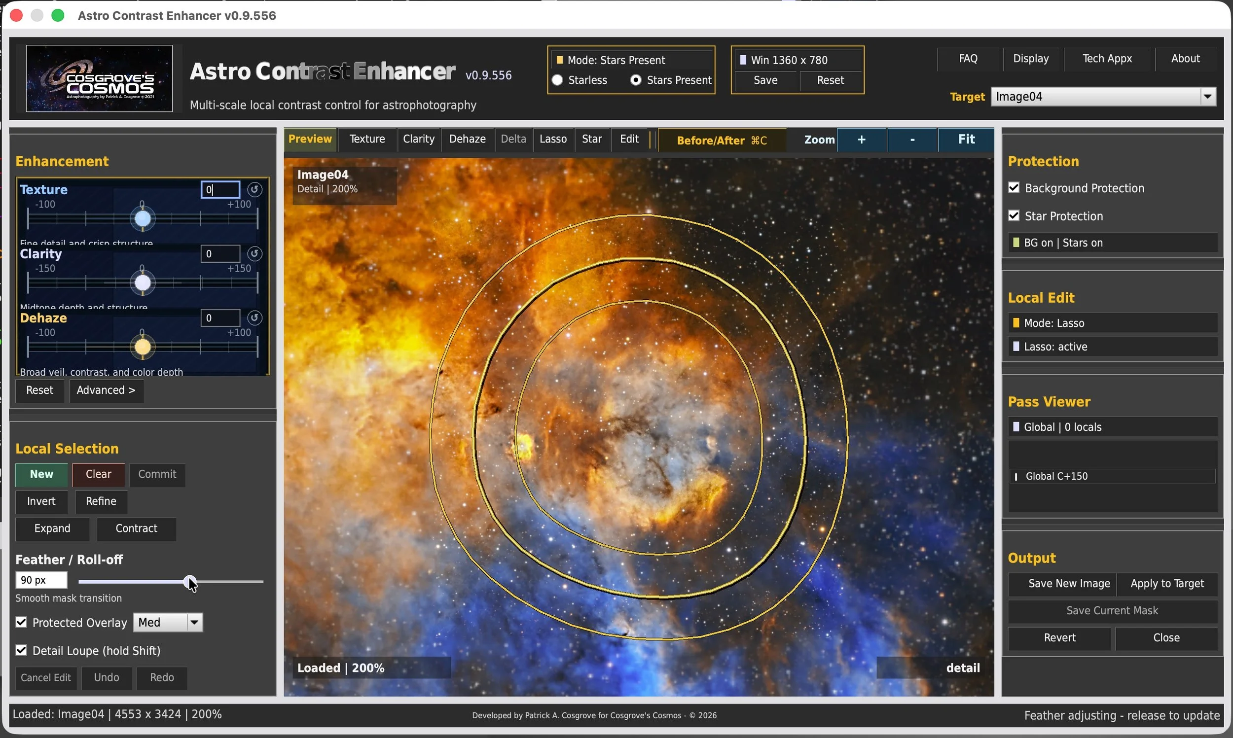
ACE addresses this with a direct local-editing workflow. A region can be outlined with the lasso, softened with feathering, moved or inverted, and then adjusted independently using the same Texture, Clarity, and Dehaze controls available globally.

The objective is not to turn image processing into a complex mask construction exercise. It is to make targeted refinement feel immediate enough that the photographer can evaluate the result while still looking at the image as a whole.

A Direct Local-Editing Workflow

Start Globally

Establish the overall Texture, Clarity, and Dehaze balance for the image.

Select the Region

Draw a freeform lasso around the area that needs separate treatment.

Shape and Protect

Feather the boundary and use star or background protection where appropriate.

Refine in Context

Adjust the selected area while judging it against the entire image in real time.

Freeform Lasso

The lasso is intended for practical image regions rather than geometric shapes. It can follow galaxy arms, nebular folds, dust structures, or any other irregular area that needs its own adjustment.

Feather and Invert

Feathering softens the transition between the selected and unselected areas. Invert makes it possible to protect the enclosed region and apply the adjustment everywhere else.

Star Protection

Stars often react more strongly than extended structures. Star protection reduces the effect on stellar profiles so contrast enhancement can be directed more toward the object itself.

Background Protection

Background protection helps keep quiet sky regions from being unnecessarily darkened or made more prominent while faint object structure is enhanced.

Global First, Local Second

In my own workflow, I usually begin with the global controls and then use local editing only where the image asks for it. This keeps the overall treatment coherent while allowing specific regions to receive more—or less—attention. It is an approach that has worked well for me, but ACE does not require a fixed order.

TakeawayGlobal controls establish the overall direction. Local editing refines the exceptions. The lasso, feathering, invert, star protection, and background protection make it possible to strengthen the region that needs help without forcing the entire image to accept the same treatment.
ACE includes safeguards intended to reduce many common contrast artifacts. Yet the controls are also intentionally allowed to go farther than most images will need.Why would a tool designed to protect the image deliberately let the photographer push an adjustment too far?
Design Philosophy

Why the Controls Are Allowed to Go Too Far

ACE includes safeguards intended to reduce common contrast artifacts, but it deliberately does not confine the controls to a narrow range of “approved” settings.

The design question If ACE is built to protect the image, why does it still allow settings that are clearly stronger than most images will need?

Simple implementations of Texture, Clarity, and Dehaze can produce attractive results at moderate settings, yet quickly break down when pushed. Halos appear, highlights clip, shadows collapse, and color can become exaggerated.

ACE includes internal safeguards intended to reduce many of those problems. They help the algorithms behave more gracefully, particularly around stars, bright structures, dark backgrounds, and strong color transitions.

Safeguards, however, are not the same as limits. I did not want ACE to decide in advance how far a photographer should be allowed to experiment. The controls intentionally extend beyond the range I would normally use because that wider range supports the way I evaluate an adjustment.

My own method is to bracket the result: begin with too little, push until the effect is clearly too much, and then move back toward the point where the image feels right. Seeing both sides of the useful range often makes the preferred setting easier to recognize.

Problems ACE Is Designed to Resist

Halos

Bright and dark rings can form around edges or stars when local contrast is increased too aggressively.

Clipped Highlights

Bright structures can lose tonal variation when enhancement pushes them too close to white.

Crushed Shadows

Dark regions can collapse into featureless black, especially when broad contrast is increased without protection.

Exaggerated Color

Strong contrast operations can make color look overstated even when saturation was not adjusted directly.

The Bracketing Method I Use
Step One Too Little

The effect is present, but the visual improvement remains uncertain or incomplete.

Step Two Too Much

Push far enough that the image clearly reveals where the treatment begins to break down.

Step Three Back to the Sweet Spot

Return toward the point where the improvement remains useful without calling attention to the processing.

This is simply the approach that works well for me. The wider control range is there to support experimentation—not to imply that stronger settings are better.

Subtle Useful Range Too Far

Safeguards Without Guardrails

ACE attempts to reduce common failure modes while still leaving the final judgment with the photographer. The useful setting will vary with the image, the selected region, the processing stage, and personal taste. The software provides protection and feedback; it does not declare one result correct.

Takeaway ACE is designed to resist common artifacts, not to prevent experimentation. The controls intentionally extend beyond the range most images will need so the photographer can bracket the effect, recognize the point where it becomes excessive, and return to a personally chosen balance.
With the tools and their design philosophy established, the next question is practical: where might ACE fit within an existing image-processing sequence? What does a sensible ACE workflow look like—and how flexible is it?
Seeing the Difference

What Does ACE Actually Change?

The most useful way to understand Texture, Clarity, and Dehaze is to compare the same image before and after each treatment.

The practical question When the theory is set aside, what should the photographer actually look for in the image?

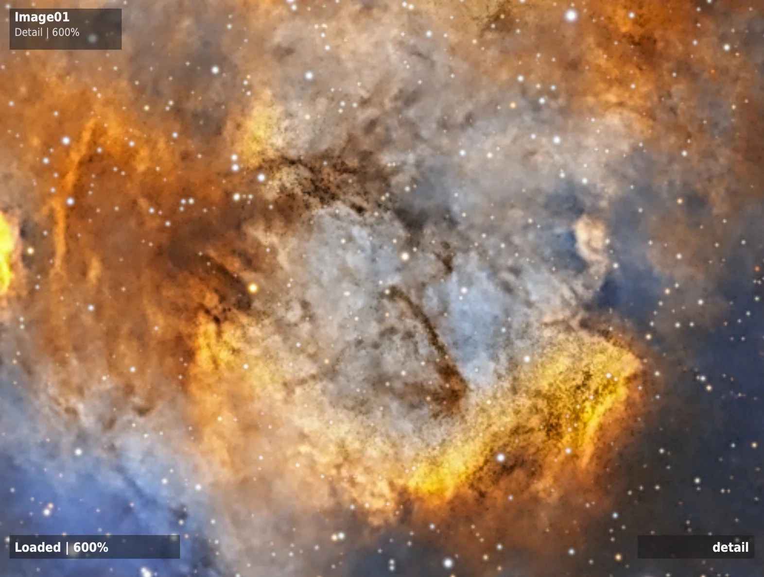
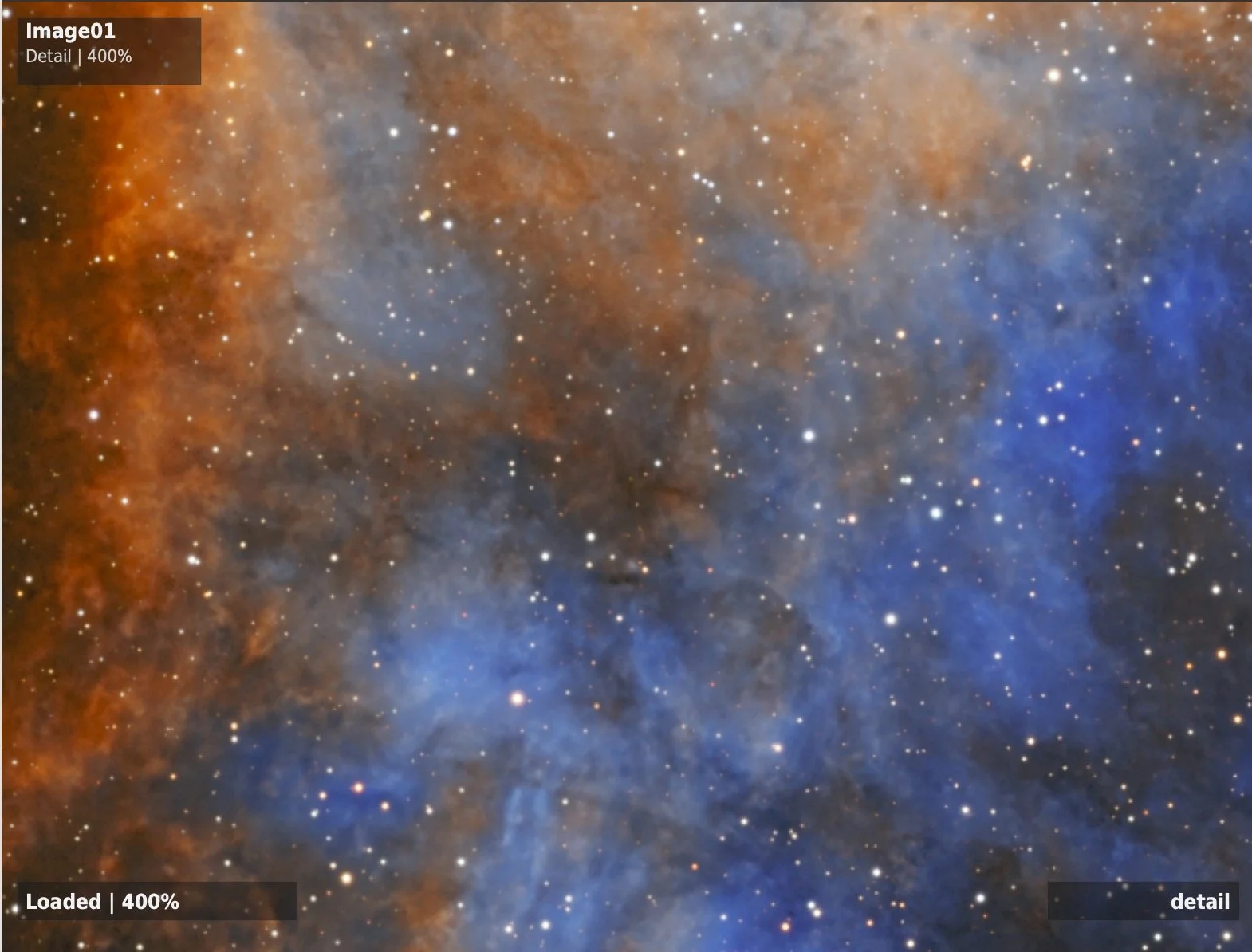
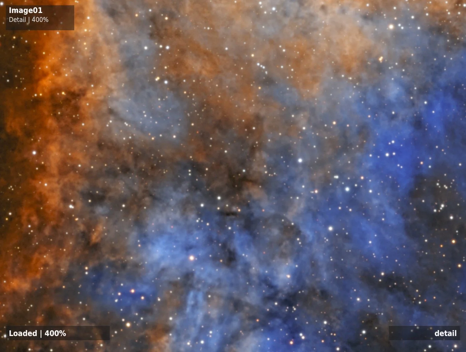
The comparisons below are intended to make the character of each control easier to recognize. Texture should reveal fine structure. Clarity should open tonal depth. Dehaze should reduce broad veiling. The combined example shows how the three approaches can complement one another without becoming one undifferentiated contrast effect.

The examples should not be read as recipes. Settings that work well for one target may be inappropriate for another. They are included to show what I was trying to accomplish and to provide a starting point for your own experimentation.
Example One

Texture — Fine Structure

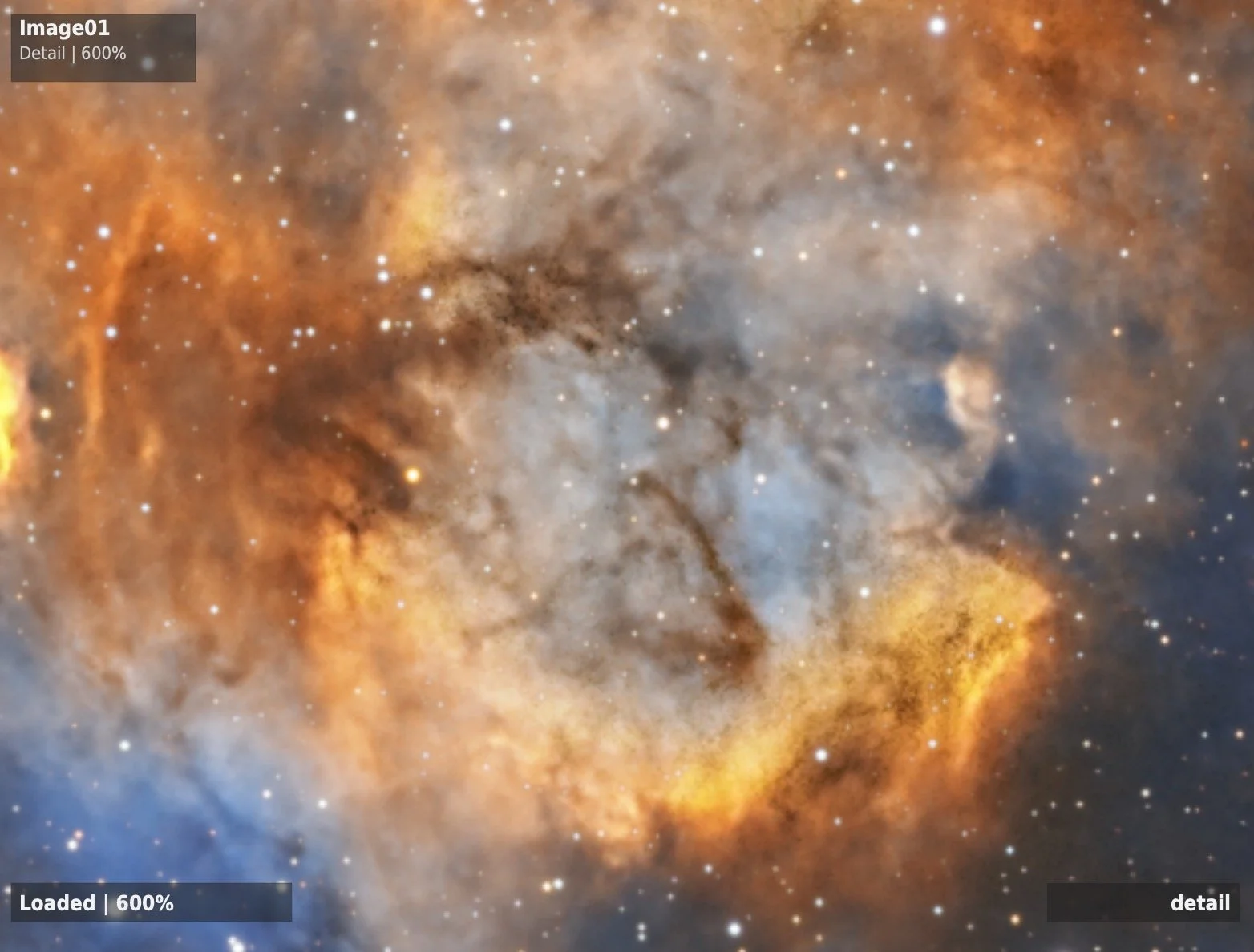
Placeholder for a close crop of a detailed nebula or galaxy.

Image Pair Needed
Texture example before ACE processing
Texture example after ACE processing
‹›
After Before

What to Examine

Look for increased visibility in filaments, folds, dust boundaries, and other fine structures. The strongest result should be improved definition without obvious edge halos, brittle detail, or amplified background noise.

Example Settings

Texture Placeholder
Texture Scale 3 px
Star Protection On

Final object name, settings, and interpretation will be added when the image pair is selected.

Example Two

Clarity — Tonal Depth

Placeholder for a galaxy or dusty nebula with layered structure.

Image Pair Needed
Clarity example before ACE processing
Clarity example after ACE processing
‹›
After Before

What to Examine

Look for stronger separation among broad tonal layers: spiral arms from dust lanes, illuminated nebular folds from darker structures, or a core from its surrounding envelope. The image should feel more open rather than merely harsher.

Example Settings

Clarity Placeholder
Clarity Scale 12 px
Background Protection On

Final object name, settings, and interpretation will be added when the image pair is selected.

Example Three

Dehaze — Broad Veiling

Placeholder for an extended nebula, dusty field, or broad galaxy structure.

Image Pair Needed
Dehaze example before ACE processing
Dehaze example after ACE processing
‹›
After Before

What to Examine

Look for reduced broad veiling, clearer separation among large structures, and stronger apparent color. The comparison should show that contrast and color improve together rather than appearing as two unrelated adjustments.

Example Settings

Dehaze Placeholder
Dehaze Scale 120 px
Highlight Protection On

Final object name, settings, and interpretation will be added when the image pair is selected.

Example Four

Combined Treatment — Working Together

Placeholder for a full-image example using all three controls.

Image Pair Needed
Combined ACE example before processing
Combined ACE example after processing
‹›
After Before

What to Examine

Look for a balanced change in fine structure, tonal depth, and broad openness. The important question is not whether the processed image is simply stronger, but whether each part of the image becomes easier to understand without the treatment calling attention to itself.

Example Settings

Texture Placeholder
Clarity Placeholder
Dehaze Placeholder
Local Editing As Needed

Final object name, settings, and interpretation will be added when the image pair is selected.

Takeaway The three controls should not merely make the image stronger. Texture should improve fine-structure visibility, Clarity should increase perceived depth, and Dehaze should reduce broad veiling. The combined result should preserve those distinct roles.
Once the examples are in place, the remaining practical question is how to add ACE to PixInsight and make sure the script appears correctly. How do existing Astro Color Mixer users and new users get started?

Pixinsight Script:

This PixInsight Script has just gone into Beta!

Would you like to try it out? I am looking for people who could use it and provide feedback and bug reports so that the tool can be fine-tuned.


New Version:

v0.9.7.11-Beta released 6-21-26!

This version introduced “Compact” mode, which operates with a smaller footprint and supports smaller screens.

Note:

Astro Contrast Enhancer v0.9.7.7-beta requires PixInsight 1.9.4 or newer.

This release has been updated for PixInsight’s new V8 JavaScript runtime, which is required by the native Apple Silicon / ARM64 build of PixInsight 1.9.4. It has also been tested on the Windows release of PixInsight 1.9.4.

If you are using an older version of PixInsight, please update PixInsight before installing or running Astro Color Mixer from the repository.

To Try it Out:

  1. In PixInsight, go to Resources->update->manage repositories.

  2. Add the repository: https://cosgrovescosmos.github.io/astro-color-mixer-pixinsight/updates/

  3. Do an Update.

  4. Exit PixInsight, and the installation will be done.

  5. You may be asked to add an “UNSIGNED Repository”. That's because this is a beta, and I have not yet applied to PixInsight for a developer ID. Go ahead and say "yes" so the script loads.

  6. Look for it under Scripts→CosgrovesCosmos→Astro Color Mixer.

Installation note:

After installing from the PixInsight repository and restarting PixInsight, Astro Color Mixer should appear in the Script menu.

Expected location: Script → Cosgrove’s Cosmos → Astro Contrast Enhancer

If the files install but the script does not appear in the Script menu, PixInsight may not have refreshed its feature-script index. This has been seen occasionally with third-party scripts.

To fix it:

If it does not appear, use:

Script > Feature Scripts > Add

Then select:

[PixInsight]/src/scripts/CosgrovesCosmos

After that, run:

Script > Feature Scripts > Regenerate

Click OK/Done.

If the script still does not appear, please send the following to contact@cosgrovescosmos.com:

- PixInsight version

- operating system

- whether the repository update reported success

- whether the script files appear to be installed

- whether Feature Scripts → Regenerate finds the script

- screenshot of the Feature Scripts window if possible

Feedback and Suggestions

Any feedback or suggestions you might have for improving the tool can be sent here: Contact@CosgrovesCosmos.com